Sunday, 31 January 2010

FMP_Balanced Religion.

I regard myself as being a 'comfortable' believer in my religion, I practice Islam, and I like many others in DIFFERENT faiths find peace and tranquility within it. I try not to get involved too much in wars, disagreements surrounding religion, am I being ignorant??

As part of my FMP I want to focus on the SPLIT, the transition onto the 'other side' or 'either side'.

What makes people believe in religion and not want to ever consider believing in a religion?

When are you regarded as a religion 'basher'

At what stage are you regarded as an extremist/fundamentalist?

....issues effecting any of the above is an FMP on its own, I initially was only going to consider typography on the Humorous Posters you get displayed outside churches, and thought how impressive it'd be if I could design a similar style poster for my religion.

I hope to interview a very good friend


Font size

Saturday, 9 January 2010

FMP_6 ideas - Humorous Church Posters

Who says God does'nt have a sense of humour! These are near my workplace, I've been walking past these for almost 13 years (not the same ones). Different bright flourescent coloured backgrounds with witty, almost comical quips.


Sunday, 3 January 2010

FMP_Resourceful Overprinting

My project’s low budget this year due to unforseen circumstances dictated the need to do something similar to split duct printing as mentioned in the H+S Posters in my blog below. its two-color printing but getting more colours out., so I thought maybe using this method as well as overlapping colors, images to emphasize the intersections between design and using set up sheets from preprinted make ready paper or screen prints on different substrates like card/plastic/metal/fabrics in large sizes. I need to visit some printers to get an idea of availability and price.


FMP_ Split duct Posters

These dramatic and economical designs use photography and overprinting to create powerful images. To make best use of paper resources during the war most posters were printed 2 up. Ink and press runs were kept to a minimum, maximum impact was still the underlining brief, they were mainly printed using a technique called, 'split duct process', two colours in one pass and a black key colour on top, ending up with a 3 colour poster on a two colour printing press.


FMP_German Master Plan

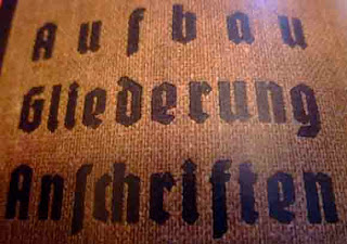
The Nazi party's obsessions with cultural dominance extended far into calligraphy, lettering and type:


Bauhaus, one of the most important and influential design movements of the modern era.


FMP_Limitless Colours!!!

Lovely, colourful graphics, folk paintings, decorations on Indian vehicles. Buses, Trucks, Bullock carts, Autorickshaws, Cycles....anything Indian!


FMP_Moire Pattern


Effect, defect, accident or design? Moire is the name given to a group of visual effects that most designers know well, at least by sight. Most moirés are incidental: they arise naturally when two or more gratings, sheets of fabric, wire screens, fences, or dot screens are superposed.

FMP_Moire Video